
Interiors that spark joy - THE PAINT GUIDE

Pierre Frey Wallpaper
How to Choose Paint Colours for North, South, East and West Facing Rooms
Choosing the right paint colours for your home can significantly impact the mood and ambiance of your space. The direction a room faces plays a crucial role in how natural light interacts with paint colours throughout the day. This interior paint guide will take you through selecting the best colours for north, south, east and west facing rooms, ensuring that your space feels inviting and harmonious.
Understanding Light and Colour
Before diving into specific colours, it's essential to understand how light affects paint. Natural light varies in intensity and warmth depending on the time of day and the direction a room faces.
North-facing rooms receive cool, indirect light, making them feel darker and often colder.
South-facing rooms benefit from warm, bright light, creating a cheerful and inviting atmosphere.
East-facing rooms enjoy soft morning light, which can enhance warm tones beautifully.
West-facing rooms are bathed in warm afternoon light, which can create a cozy and vibrant environment.
Choosing Colours for Each Direction
North-Facing Rooms
For north-facing rooms, opt for warm and light colours to counteract the coolness of the light. Consider:
Soft whites and creamy neutrals to brighten the space with yellow under tones; try Little Green’s ‘stock’ or ‘rolling fog’. Farrow and Ball’s ‘Joa’s White’ also works well.
Warm pastels shades of pink or soft yellow to add a touch of warmth, such as Paint and Paper Library’s ‘Rose Cluster’ or Farrow and Ball’s ‘scallop’ or ‘whirlybird’.
Earthy tones such as terracotta or warm greys can also work well; try Farrow and Ball’s ‘Red Earth’ and ‘Green Smoke’, or ‘Silt’ by Little Green.
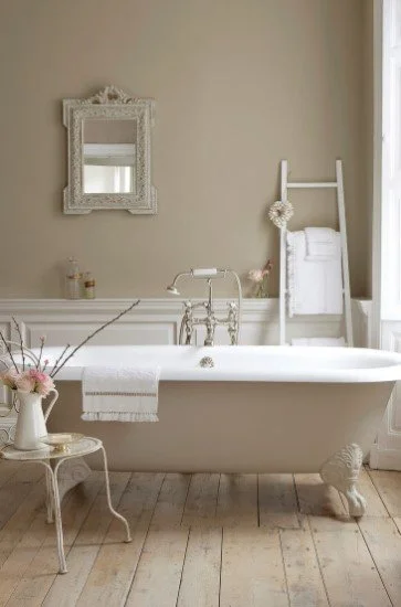
Image from Little Green
South-Facing Rooms
South-facing rooms are perfect for bolder colours since they receive ample sunlight. You can experiment with:
Rich jewel tones like emerald green, sapphire blue, or deep burgundy to create a dramatic effect. Try ‘marine blue’ from Farrow and Ball or ‘hicks blue’; equally ‘Adventurer 7’ from Little Green is great .
Warm neutrals such as beige or taupe to maintain a cozy feel. A great place to start is ‘school house white’ from Farrow Ball, or try ‘slacked lime’, ‘gauze’ and ‘french pale grey’ from Little Green.
Bright colours like sunny yellows or vibrant oranges to enhance the cheerful atmosphere. Farrow and Ball’s ‘duster yellow’ is amazing and adds a real bit of fun.
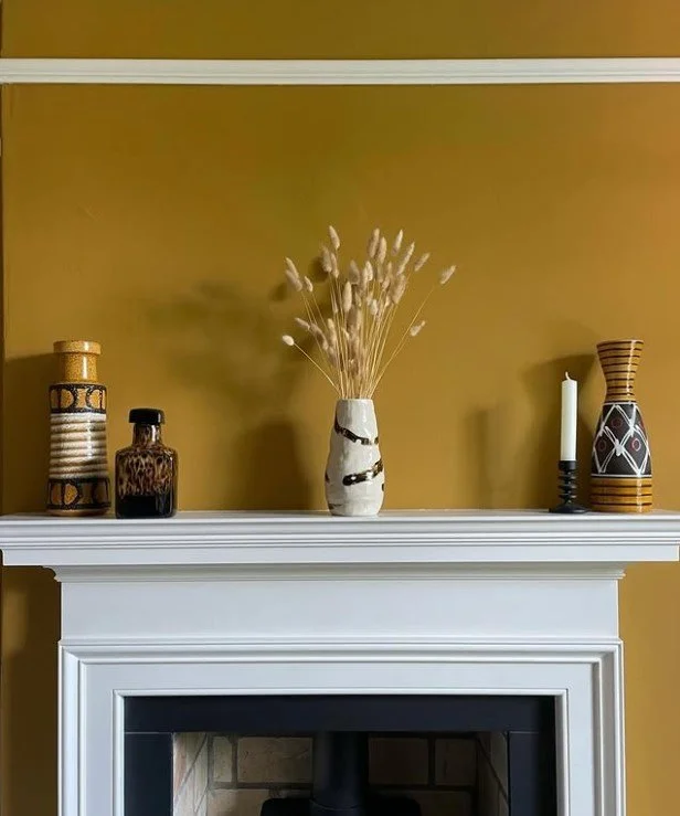
Image by Paint and Paper Library
East-Facing Rooms
East-facing rooms benefit from soft morning light, making them ideal for warm and inviting colours. Consider using neutrals with a green undertone to help create a balance.
Soft yellows or peaches to reflect the warmth of the morning sun. Paint and Paper Library’s ‘morning room’ is beautiful .
Light blues or greens to create a fresh, airy feel. Little Green’s ‘celestial blue’, or Farrow and Ball’s ‘theresa’s green’, both offer beautiful starting points.
Warm whites can also work well, providing a clean backdrop that feels welcoming. Try Paint and Paper Library’s ‘cashmere’ or ‘paper’.
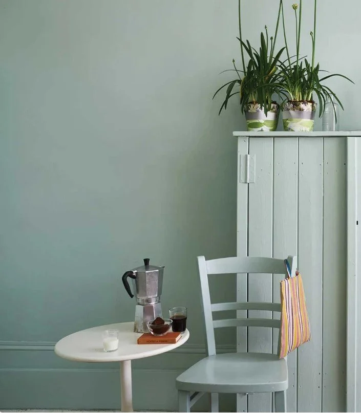
Image by Farrow and Ball
West-Facing Rooms
West-facing rooms receive warm afternoon light, which can create a cozy vibe. Suitable colours include:
Warm tones like terracotta, rust, or golden yellows to complement the afternoon sun. Farrow and Ball’s ‘setting plaster’ and Paint and Paper Library’s ‘stone V’ and ‘mole skin’.
Deep, rich colours ,such as burnt orange or warm browns, for a a bold accent colour; try using ‘Tea with Florence’ or ‘sage and onions’ by Little Green . The new ‘Marmelo’ or ‘Bamboozle’ would also work well, both from Farrow and Ball.
Soft neutrals can also work, but consider adding accents in warmer shades to enhance the warmth. A lovely colour for a west facing neutral is ‘wimborne white’ or Paint and Paper Library’s ‘stone’ or ‘slate’.
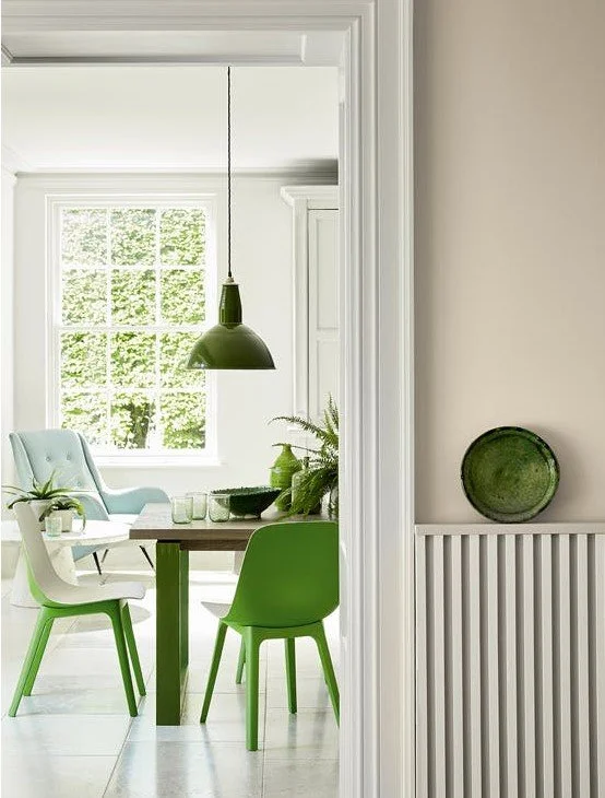
Image from Little Green
If you think that a home visit would be useful to help you work out your colours and you live in Surrey /SW London, then please head to my contact page and get in touch. Quote BLOG for a 10% discount on your first colour consultation.